
(Images made by author with DALL·E)
Data visualization is a powerful way to convey insights from raw data. Python’s robust visualization libraries make it possible to create informative charts. However, creating impactful visualizations with these tools can be time-consuming and challenging. This is where chatbots like ChatGPT become invaluable. In this post, we will illustrate how ChatGPT can help generate captivating data visuals using Python libraries such as Matplotlib and Seaborn. You will see how its assistance streamlines the data visualization process, making it more efficient and effective.
Table of Contents
The Process
First of all, let’s look at the step-by-step process we used to create these informative data visuals.
- Data Preparation: We organized the data for effective visualization.
- Coding: Using ChatGPT, we generated tailored Python code snippets. This approach considerably simplified the coding process, eliminating the need for coding from scratch.
- Iterative Refinement: With ChatGPT’s assistance, we fine-tuned the code for desired visuals.
- Creating Charts: We pasted the code snippets into Jupyter Notebook to generate the charts.
The Data
Before we proceed to the charts, let’s introduce the dataset. It contains monthly returns from January 2014 to August 2023 for an equity index, presented in two dataframes with the following formats:
- Long-form (df_data): Includes returns and end-of-month dates.
- Wide-form (df_data_pivot): Arranges months as columns and years as the index, ideal for highlighting patterns.
Exploring the charts
To begin, it’s important to recognize that different chart types serve distinct visualization purposes. The selection of the appropriate chart depends on the specific questions at hand.
Now, let’s explore the charts that were generated with the assistance of ChatGPT. You will find the corresponding code snippets at the end of this post.
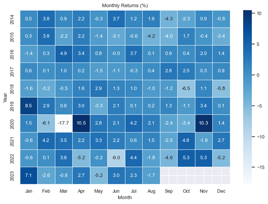
Heatmap
A heatmap is a grid-based visualization of data that uses color to indicate the intensity of values in a dataset. In the example below, it displays the distribution of monthly returns, with darker shades representing higher values and lighter shades representing lower values. The gradient between dark and light colors denotes intermediary values.
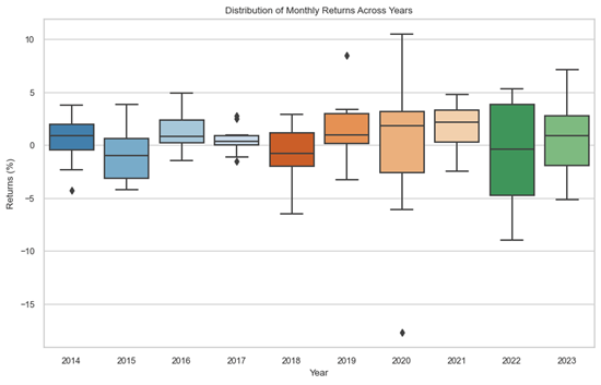
Boxplot
Boxplots are a type of statistical visualization that can be used to represent graphically the distribution of data through a box and whisker arrangement, highlighting the range, median, and outliers.
The first boxplot below divides the observations by month and plots the distribution of returns of each month in the dataset. The second boxplot illustrates the dispersion of monthly returns, this time for each year.

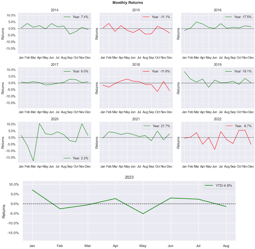
Faceted Line Plots
These charts divide visualizations into smaller subplots, allowing simultaneous exploration of different data aspects. In the chart below, it displays the line plot of monthly returns for each year in the dataset.
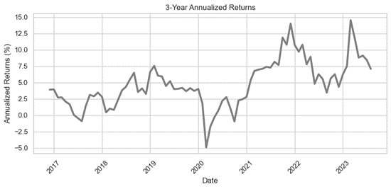
Single Line Plot
The chart below is a 3-year rolling line plot that displays the index’s performance over the dataset’s time span. It was generated by annualizing 3-year returns calculated from monthly returns. This is a useful way to see the long-term performance of the index, as it smooths out any short-term fluctuations.
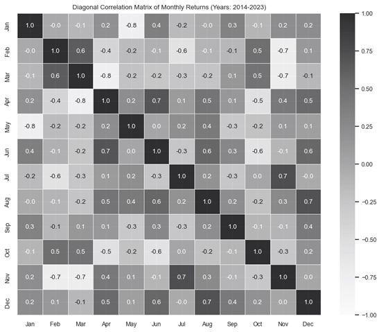
Correlation Matrix
The correlation matrix uses colors to represent the strength and direction of linear relationships between variables, with darker values indicating strong positive linear correlations. In the chart below, the darker values indicate that the returns for pairs of months have a strong positive linear relationship. Conversely, lighter values indicate weaker or negative linear correlations.
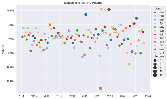
Scatter Plot
A scatter plot depicts the relationship between two variables by displaying points on a graph. It is valuable for identifying trends, clusters, or outliers. For example, in the chart below, we can observe that the return for March 2020 is an outlier when compared to the rest of the dataset. The visualization can be enhanced by adding hue (color variations) and adjusting point size parameters, making it easier to distinguish between months and gain a deeper understanding of the significance of monthly return values.
Conclusion
In summary, this blog explored how ChatGPT can be a valuable asset for generating insightful data visualizations. In particular, we explored different chart types and illustrated how ChatGPT can help generated them. By leveraging ChatGPT’s capabilities, data analysts can streamline the data visualization process and uncover actionable insights from raw data. This partnership offers a powerful way of communicating insights and improving decision-making in a data-driven world.
Code snippets
Heatmap
# Set default font size / Adjust the font_scale value as needed
sns.set(font_scale=0.8)
# Draw a heatmap with the numeric values in each cell
f, ax = plt.subplots(figsize=(9, 6))
sns.heatmap(df_data_pivot*100, annot=True, fmt=”.1f”, linewidths=.5, ax=ax, cmap=’Blues’)
plt.ylabel(“Year”)
plt.xlabel(“Month”)
plt.title(“Monthly Returns (%)”)
plt.show()
Boxplot (chart1)
# Create the horizontal boxplot
plt.figure(figsize=(10, 6))
# set the style
sns.set_style(“whitegrid”)
sns.boxplot(data=df_data_pivot*100, palette =”tab20c”) # Multiply by 100 to get percentage values
plt.title(“Distribution of Returns by Month (Years: 2014-2023)”)
plt.xlabel(“Month”)
plt.ylabel(“Returns (%)”)
plt.show()
Boxplot (chart2)
# Create the horizontal boxplot
plt.figure(figsize=(10, 6))
sns.boxplot(data=df_data_pivot.T*100, palette =”tab20c”) # transpose the Dataframe
plt.title(“Distribution of Monthly Returns Across Years”)
plt.xlabel(“Year”)
plt.ylabel(“Returns (%)”)
plt.show()
Faceted Line Plots
#This code enables to reproduce a simplified version of the charts (without the colors)
# Calculate the number of rows and columns for the grid
num_rows = 3
num_cols = 3
sns.set_theme(style=”whitegrid”, context=”talk”)
# Create facets of bar charts for each year
years = df_data_pivot.index
num_years = len(years)
sns.set(font_scale=1.2)
# Create a figure for the first 9 years’ graphs
fig, axes = plt.subplots(num_rows, num_cols, figsize=(15, 10), sharey=True)
for idx, (year, ax) in enumerate(zip(years[:-1], axes.flatten())):
# Add an overall title above the subplots
fig.suptitle(“Monthly Returns”, fontsize=16, fontweight=”bold”)
# Adjust layout
plt.tight_layout()
# Calculate the width of the previous grid of charts
previous_grid_width = num_cols * 3
# Create a single chart for the last year’s graph with the same width
sns.set(font_scale=0.9)
fig2, ax2 = plt.subplots(figsize=(previous_grid_width, 3))
last_year = years[-1]
sns.lineplot(data=pd.DataFrame(df_data_pivot.loc[[last_year]].T), x=df_data_pivot.loc[[last_year]].T.index, y=last_year,
ax=ax2, color=”#8a9cb5″, linewidth=2)
ax2.set_xlabel(“”)
ax2.set_ylabel(“Returns”)
ax2.set_title(str(last_year))
ax2.yaxis.set_major_formatter(plt.FuncFormatter(lambda x, loc: “{:.1%}”.format(x))) # Format y-axis as percentage
# Set y-axis limits for fig2, ax2 based on the values from fig, axes
y_limits = axes[0, 0].get_ylim()
ax2.set_ylim(y_limits)
# Adjust layout
plt.tight_layout()
plt.show()
Single Line Plot
# Set style
sns.set(style=”whitegrid”)
# Create a line plot using Seaborn
plt.figure(figsize=(10, 4)) # Set figure size
sns.lineplot(x=melted_df_data_pivot.index, y=’36M_Rolling_Returns’, data=melted_df_data_pivot,linewidth=3,color=”grey”)
# Customize the plot
plt.title(‘3-Year Annualized Returns’)
plt.xlabel(‘Date’)
plt.ylabel(‘Annualized Returns (%)’)
plt.xticks(rotation=45)
plt.show()
Correlation Matrix
# Calculate the correlation matrix
corr_matrix = df_data_pivot.corr()
# Adjust the font_scale value as needed
sns.set(font_scale=0.8)
# Create the diagonal correlation matrix heatmap
plt.figure(figsize=(10, 8))
sns.heatmap(data=corr_matrix, annot=True, cmap=”Greys”, vmin=-1, vmax=1, fmt=’.1f’, alpha=0.8,linewidths=.5)
plt.title(“Diagonal Correlation Matrix of Monthly Returns (Years: 2014-2023)”)
plt.ylabel(“”)
plt.xlabel(“”)
plt.show()
Scatter Plot
import matplotlib.ticker as mticker
data = df_data
# set the style
sns.set_style(“darkgrid”)
# Adjust the font_scale value as needed
sns.set(font_scale=1.0)
# Calculate point sizes based on returns
point_sizes = (data[“Returns”] * 100).abs()
# Extract month from the Date column
data[“Month”] = data.index.strftime(“%b”)
# Create the scatterplot
plt.figure(figsize=(10, 6))
scatter = sns.scatterplot(data=data, x=”Date”, y=”Returns”,size=point_sizes, sizes=(100, 250), hue=”Month”, palette=”tab20″,hue_order=data[“Month”].unique())
# Set y-axis labels as percentages
scatter.yaxis.set_major_formatter(mticker.PercentFormatter(xmax=1))
# Adjust legend position
scatter.legend_.set_bbox_to_anchor((1, 1))
# Add titles and labels
plt.title(“Scatterplot of Monthly Returns”)
plt.xlabel(“”)
plt.ylabel(“Returns”)
# Adjust legend and layout
plt.tight_layout()
plt.show()
Additional Resources
Seaborn: Statistical data visualization
Anaconda (a Python distribution that includes many useful packages, such as the Jupyter Notebook, which can be used to run Python code.)

Leave a comment