

(Images made by author with Copilot)
INTRO TEXT
Table of Contents
Building on our previous exploration of Large Language Models’ (LLMs) remarkable ability to generate detailed image descriptions, this post delves further. We’ll investigate whether these models can also extend their capabilities beyond the art world and assist with coding tasks. As a real-world example, we’ll use Claude3 Sonnet (hereafter referred to as Claude) to create a financial chart through an experiment.
Objective
Our goal is to leverage Claude to generate Python code for a financial chart that combines historical price data of an asset with its projected future prices. The key is to ensure a seamless visual transition between historical and projected data.
Methodology
We first simulated the market cap of a reference asset. This information is then used to project the prices of a second asset over a specified investment horizon. Finally, we combine the historical price data of the second asset with its projected prices to create a comprehensive price chart.
To achieve this, we issued a series of detailed prompts to Claude, guiding it towards the desired outcome. While we won’t delve into each prompt, here’s a breakdown of the key steps we requested:
- Download historical asset prices (reference asset) and calculate its volatility (standard deviation) to simulate multiple market cap paths over the horizon (assuming normal returns).
- Download historical prices for the second asset and calculate its projected prices over the investment period, assuming the second asset’s market cap falls within a designated range relative to the reference asset.
- With both historical and projected prices in hand, generate, for the second asset, a chart that visually combines this information.
Iterative Refinement
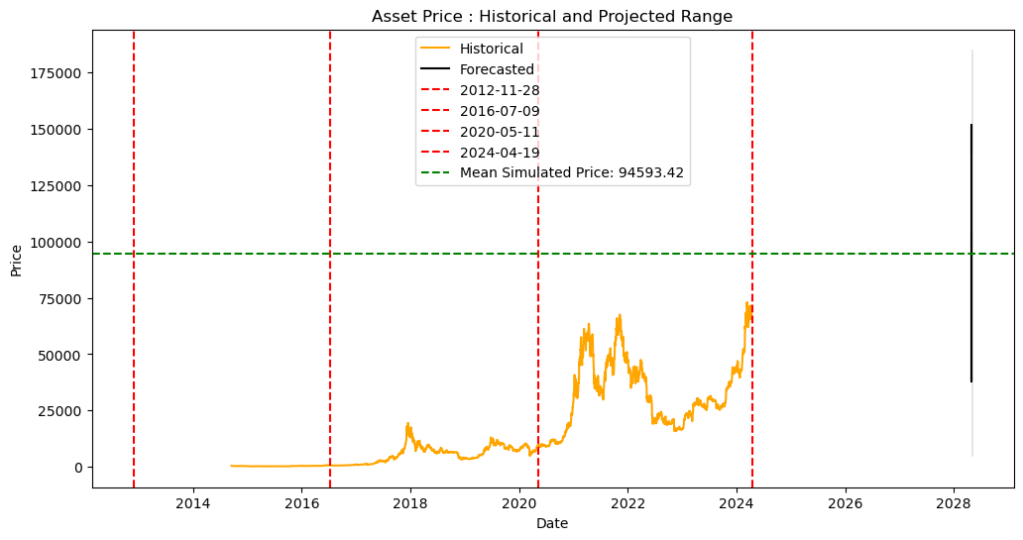
Claude provided a well-explained initial Python script for generating the chart. After clarifying some points and making adjustments, when run in Jupyter Notebook, the script produced a chart that partially met our objective. It successfully plotted both historical and projected prices for the second asset on a single chart, but the visual transition between the two lacked clarity as shown below:
Visual Feedback Loop
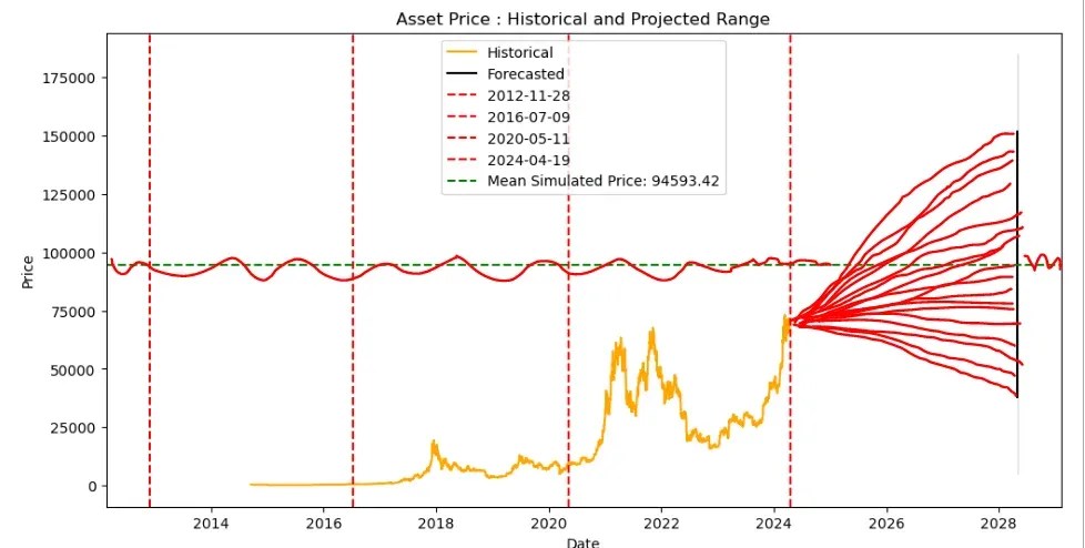
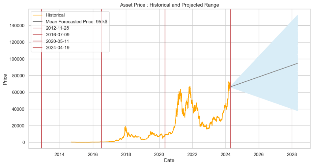
To address the continuity issue, we captured screenshots of the generated chart above, annotated the image to highlight the problem, and shared them with Claude along with a concise explanation. Impressively, Claude interpreted the annotated image and provided revised code that successfully addressed the continuity problem. This is evident in Claude’s response, “Sure, I understand the desired modifications. Here’s the updated code that should produce output similar to the first image“, which demonstrates its ability to effectively read and interpret visual requirements.
The annotated image and the final chart are presented below:
Conclusion
This experiment explored how visual input can improve the iterative development of code generated by Large Language Models (LLMs). We used Claude to generate Python code for a financial chart, specifically focusing on achieving seamless transitions between historical and projected price data.
Although Claude’s initial code lacked visual clarity, it showed significant improvement after receiving feedback through an annotated image.
Looking ahead, as LLMs advance, they hold immense promise as valuable coding assistants. Imagine using clear instructions and visuals to translate complex coding tasks, allowing LLMs to generate the necessary code. This development could significantly boost programmer productivity and unlock exciting possibilities across various fields.
Notes:
The information presented in this post is intended for educational purposes only.
This post was researched and written with the assistance of various AI-based tools.

Leave a comment